

Logo vs. Visual Brand Identity: Why a Logo Alone Won’t Save a Fragmented Business
For high-growth founders and C-suite executives, building a scalable business requires endless allocation decisions. Yet, one of the most persistent, and expensive, executive mistakes occurs early in the company lifecycle: treating a logo as a complete visual strategy.
Many leadership teams fall into the trap of outsourcing a quick logo design to a freelance marketplace or budget agency. They receive a clean vector file, place it in the header of their website, paste it onto a pitch deck, and declare their branding “complete.”
Months later, the symptoms of brand fragmentation begin to surface:
-
The marketing team produces social media ads that look like they belong to three completely different companies.
-
The product UI feels disconnected from the sales deck presented to enterprise prospects.
-
Paid ad campaigns experience declining click-through rates because visual touchpoints lack cohesive recognition.
A standalone logo is merely a signature. It cannot fix a fractured customer experience or unify disparate digital touchpoints. When a business relies solely on a logo without a underlying visual system, it creates brand fragmentation—a strategic vulnerability that silently leaks revenue, inflates customer acquisition costs (CAC), and erodes market trust.
As a premier brand strategy consultancy, Nimus Creatives builds scalable brand architecture. Understanding the distinction between visual brand identity vs logo design is the first step toward reclaiming your market positioning and protecting your bottom line.
The Anatomy of a Complete Visual Brand Identity
A logo is a single mark of identification. A visual brand identity, by contrast, is an interconnected ecosystem of visual assets, rules, and behavioral guidelines designed to govern every touchpoint a customer interacts with.
Without comprehensive brand system design, every new marketing campaign, product feature, or corporate deck requires design teams to make isolated, unguided decisions. Over time, this creates visual entropy.
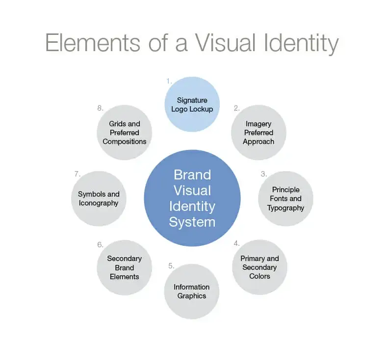
To achieve long-term market dominance and operational scalability, a complete visual brand identity must define four core architectural layers:
1. Color Architecture
Color is the most immediate sensory trigger a brand possesses. A robust visual identity goes beyond selecting two “favorite” colors; it establishes a multi-tiered color architecture:
-
Primary Palette: Distinctive, trademarkable colors that drive core brand recognition.
-
Secondary & Tertiary Palettes: Functional shades built for background depth, accents, and data visualization.
-
Semantic Color Systems: Explicit color assignments for UI feedback (success, warning, error) and dark/light mode environments.
-
Contrast & Accessibility Compliance: Strict WCAG guidelines ensuring legibility across screen types and ambient lighting conditions.
2. Typography Systems
Typography carries the verbal tone of your business into the visual realm. A complete visual system establishes an intentional typographic hierarchy that balances editorial personality with interface utility:
-
Display Fonts: High-character typefaces reserved for hero headlines and campaign anchors.
-
Body & System Fonts: High-legibility sans-serif or serif families optimized for prolonged reading on low-DPI screens.
-
Typographic Scale & Grid Rules: Standardized ratios for line height, letter spacing, paragraph spacing, and responsive scaling across desktop, mobile, and print mediums.
3. Image Direction & Art Direction
Without explicit art direction, marketing teams default to generic, mismatched stock imagery that destroys brand authority. A comprehensive brand system defines:
-
Photography Style: Rules regarding lighting (e.g., high-contrast editorial vs. warm natural light), depth of field, subject framing, and human emotion.
-
Illustration & Graphic Assets: Custom vector styles, 3D render guidelines, textural overlays, and pattern libraries unique to the company.
-
Editorial Composition: Grid layouts and focal-point principles for combining imagery, copy, and UI elements.
4. UI Guidelines & Component Systems
For modern technology and tech-enabled businesses, the digital product is the brand experience. Visual identity must seamlessly translate into product development via comprehensive UI guidelines:
-
Design Token Systems: Standardized values for spacing, border radii, shadows, and elevation.
-
Interface Components: Rules governing button states, modal layouts, input fields, and navigation bars.
-
Motion & Micro-interactions: Defined easing curves and animation durations that dictate how the brand feels during user interaction.
Why a Logo Is Just the Tip of the Iceberg
To understand the core debate surrounding visual brand identity vs logo, executives must analyze consumer psychology and how the human brain processes visual trust markers.
+-----------------------------------------------------------------------+
|                         THE BRAND ICEBERG                             |
|                                                                       |
|                                 /\                                    |
|                                /  \   <-- THE LOGO (Visible Surface)  |
|                               /____\                              |
|-----------------------------------------------------------------------|
|  THE VISUAL IDENTITY SYSTEM (Sub-surface Depth & Trust Architecture)   |
|                                                                       |
|  • Color Architecture       • Typography Hierarchy                   |
|  • Art Direction & Imagery  • Digital UI Component Systems            |
|  • Micro-Interactions       • Brand Strategy & Positioning            |
|                                                                       |
+-----------------------------------------------------------------------+
When a prospective buyer encounters your business, their brain evaluates visual cues in milliseconds – long before they read a single line of body copy or analyze your feature list. Neuroscience calls this cognitive fluency: the ease with which the brain processes information.
High cognitive fluency signals safety, professionalism, and competence. Low cognitive fluency – caused by visual misalignment, jarring font choices, or inconsistent layout grids, triggers immediate subconscious hesitation.
The Mechanism of Visual Trust Markers
A logo acts as a point of recall, but the environment surrounding that logo establishes perceived value.
-
The Halo Effect: If an enterprise buyer sees a pristine pitch deck, but arrives at a website with misaligned typography, low-contrast buttons, and stock photos, their brain attributes the visual friction to operational incompetence.
-
Pattern Recognition: Premium brands like Apple, Stripe, and Porsche do not win market share simply because their logos are memorable. They win because every millimeter of their ecosystem, from product packaging to email footers—adheres to an uncompromising visual standard.
-
Reduction of Buyer Friction: Consistent visual language removes cognitive noise. It allows the buyer to focus entirely on your value proposition rather than deciphering an unpolished presentation.
A logo sitting atop a disorganized design structure is like putting a luxury badge on a broken engine. It highlights the underlying flaws rather than disguising them.
The Financial Cost of Fragmented Branding
Brand fragmentation is not an aesthetic issue; it is a balance-sheet liability. When executive teams treat design as an isolated tactical task rather than a strategic system, the business incurs compounding operational costs.
                    THE COST OF BRAND FRAGMENTATION

   +--------------------+     +--------------------+     +--------------------+
   |  Diluted Ad Spend  |     | Lower Conversions  |     | Operational Drag   |
   +--------------------+     +--------------------+     +--------------------+
   | High bounce rates; |     | Disconnected UI    |     | Engineering and    |
   | low ad recall;     | --> | causes buyer       | --> | design re-invent   |
   | inflated CAC.      |     | hesitation.        |     | wheels endlessly.  |
   +--------------------+     +--------------------+     +--------------------+
                                        |
                                        v
                           [ ERODED BRAND EQUITY ]
1. Diluted Ad Spend and Elevated CAC
When paid media acquisition campaigns fail to align visually with landing page environments, bounce rates skyrocket.
If a prospect clicks a sleek, modern social ad and lands on an outdated page with conflicting fonts and color palettes, the visual disconnect breaks the scent trail. The user experiences immediate dissonance and exits. The result is lowered ad relevance scores, higher CPMs, and wasted acquisition capital.
2. Lower Conversion Rates Across Sales Pipelines
In enterprise B2B sales, credibility is currency. When sales representatives distribute customized decks, sales collateral, and one-pagers created without central brand governance, the market perceives a lack of enterprise maturity.
Inconsistent visual presentation signals to prospective buyers that your internal operations may be equally disorganized, leading to prolonged sales cycles and discounted deal sizes.
3. Engineering and Design Drag
Without a unified brand system design, product engineers and marketing managers spend hundreds of billable hours re-inventing basic assets:
-
Developers build custom components from scratch instead of consuming an established design system.
-
Marketers re-create templates for every new content asset.
-
Freelancers and internal designers waste time debating basic design decisions like button padding, font sizing, and color codes.
A comprehensive rebranding strategy streamlines production velocity, enabling teams to deploy campaigns and ship product features in days rather than weeks.
Conclusion: Transitioning from a Logo to a System
A logo alone cannot carry the strategic weight of a modern enterprise. In an increasingly noisy digital marketplace, businesses cannot afford the hidden tax of fragmented visuals and disjointed customer experiences.
Sustainable enterprise value demands an integrated visual system—a cohesive architecture where strategy, typography, color, and interface design work in unison to command premium pricing and establish market category leadership.
If your current customer touchpoints feel disconnected, or if your visual collateral no longer reflects the true scale and sophistication of your offering, it is time to shift from superficial design fixes to a systemic solution.
Stop leaking revenue to brand fragmentation. Partner with Nimus Creatives to engineer a cohesive visual brand architecture built for enterprise growth.